Caliper UI
Published on npmKey Outcome
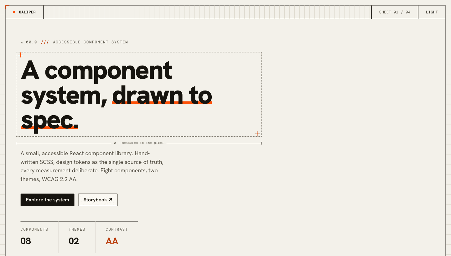
A production React component library and design system, published on npm as @ryancalacsan/caliper-ui: 41 components from one token layer, two themes switched by a data attribute, zero runtime dependencies, and WCAG 2.2 AA verified by an automated contrast check and axe on every Storybook story. Its design tokens sync between code and Figma via W3C DTCG. This portfolio is built with it.
The Challenge
I wanted to show design-system craft without a utility framework. The aim was a small component library styled in hand-written SCSS with BEM, where one token layer is the single source of truth for color, type, spacing, radii, motion, and breakpoints.
Accessibility had to be real rather than claimed, both themes had to come from the tokens alone, and the whole library had to be tested and gated in CI so the quality bar held on every change.
What I Built
A React and TypeScript library, built with Vite and styled entirely in hand-written SCSS:
- Published as an installable npm package (@ryancalacsan/caliper-ui), shipped as ESM with type declarations, RSC-ready (server-renderable where possible, with "use client" only where needed), self-contained CSS that inlines its fonts, and zero runtime dependencies (React is the only peer dependency).
- 41 accessible components across actions and forms, overlays, layout, typography, content and data display, navigation, and the Spec Sheet drawing motifs. Interactive parts like Modal, Select (a custom ARIA listbox), Tabs, and Tooltip use real semantic elements, focus traps, and full ARIA wiring with managed focus.
- A "Spec Sheet" visual identity: warm paper and ink with one construction-orange accent, drawn like a technical document. Light and dark themes come from one token set and switch by a data attribute, with no component changes between them.
- Design tokens authored in W3C DTCG format as the single source of truth, generating both the CSS and a Figma variable library (light and dark as Figma modes), with drift detection in CI.
- WCAG 2.2 AA verified, not assumed. A script checks every color pairing in both themes, Storybook runs axe on every story, and prefers-reduced-motion is respected throughout.
- Engineered like a real product: Vitest interaction tests, Playwright visual regression in both themes, GitHub Actions CI, Changesets-driven releases, and npm Trusted Publishing (OIDC with provenance, no stored secrets).
It deploys on Vercel from one GitHub-connected project, with the demo at the root and the component docs in Storybook. Install it with npm i @ryancalacsan/caliper-ui.